In the vibrant world of design, color is more than a visual treat; it is a powerful conveyer of emotions and messages. In this blog post, we start a journey through the fascinating world of color psychology, exploring how hues can evoke feelings, shape perceptions and transform your designs into compelling visual stories.
The Language of Colors:
Dive into the basics of color psychology. Understand the emotions and associations often associated with different colors. From the warmth of red to the tranquility of blue, each hue has its own story.
Color Psychology in Branding:
Explore the impact of color on brand identity. Discuss case studies of well-known brands and how their color choices align with their message. Learn how your color palette can improve brand recognition and appeal to your target audience. For example: In hospitals, and in banks/ finances, tech companies, they use a lot of blue colors, which transmits calmness, trust, safety.
Another example: McDonald’s’ golden arches are kid-friendly, fun, and recognizable all over the world. Bright, sunny yellow attracts attention: it’s a color that won’t be ignored. Its association with joy, happiness, and energy has been shown to encourage mental activity, generate muscle energy, and on the whole, cheer you up.
Create Emotional Connections:
Delve into the emotional responses that colors evoke. How can you use this knowledge to connect with your audience on a deeper level? Explore the color psychology combinations and their effect on mood and perception.
Red could evoke for example: attention, danger, or take action now, also red is known for love. Green could evoke growth and vitality. As we saw abobe, Mac Donalds uses yellow, just like a lot of other fast food restaurants in combination with red. Black is a sign of luxury, minimalistic, exclusive, ect.
Color Harmony in Design:
Discuss the principles of color harmony and how to create visually appealing combinations. Whether complementary, analogous or monochromatic, understand the art of balancing colors to enhance the overall aesthetic appeal of your designs. You can use website like Adobe Color, to get inspired and to play around with the color wheel, to get the colors in harmony.
There is a new Adobe tool, via the adobe color page, via Adobe Firefly or via Adobe Illustrator, where you can upload an .SVG file, and automatically it will come with other color options, see image below.
Color trends:
Stay ahead of trends by exploring current color trends. Discuss the Pantone Color of the Year and other influential color predictions. Learn how to incorporate trendy colors into your designs while maintaining a timeless quality.
Practical Tips for Designers:
Start with making different mood boards before choosing your clients’ brand colors. Within your client’s project brief, you will discover directives outlining the desired customer experience your client envisions for their brand. If you see words as, calm, energy, nature, etc. Find stock photos (canva Pro is amazing for this), and make the mood boards out of that. Try to make the mood boards also in color harmony, some with more saturated colors, and some with desaturated, more or less vibrant for example…
Show 2 or 3 Different Design Options in Your Community:
Share your designs in a community with designers, Facebook groups are amazing for this. Here you’ll get comments on your work and from here you can only get better! Don’t be afraid to put yourself out there, there is always people you can learn from and will give you constructive feedback.
Finalise Client’s Brand in a Presentation
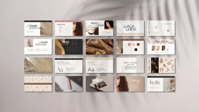
The whole brand where you’ve been working on comes together when you share your client’s brand using a simple brand kit or a more detailed client’s presentation. Once they give the green light, you can move on to explaining the Brand Guidelines. An example of a Brand Guidelines presentation you can see here.